
Delta Blues unveil new logo
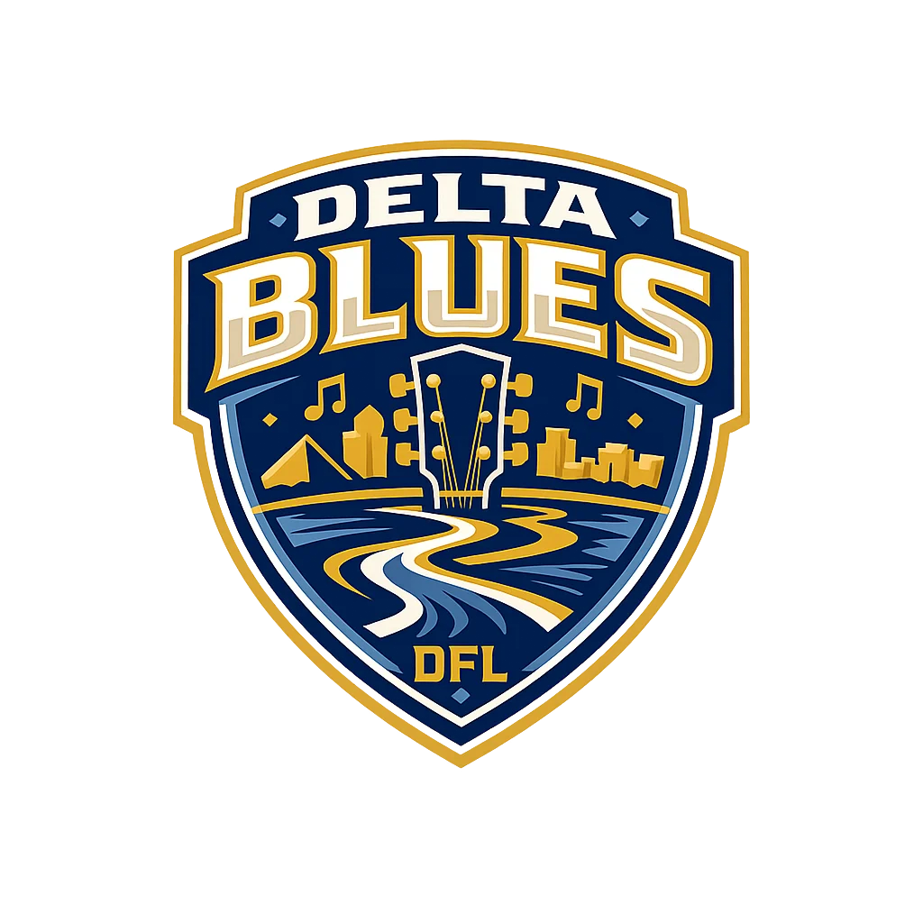
MEMPHIS, TENNESSEE — The Delta Blues today officially unveiled a new team logo, introducing a visual identity designed to reflect the franchise’s connection to Memphis, the Mississippi Delta and the growing DFL.
The new crest features the Blues’ primary navy and gold colors and brings together several elements representing the culture and character of the region. The head of a guitar sits at the center of the design, surrounded by musical notes and imagery inspired by the Memphis skyline, while a winding river runs through the lower portion of the crest as a tribute to the Mississippi River and the broader Delta region.
The DFL name is also incorporated prominently into the mark, emphasizing the Blues’ place within the league as the franchise continues building its identity both locally and nationally.
“This logo is about where we come from and what we want the Delta Blues to represent,” team owner Madison Hillman said. “Memphis has one of the most recognizable cultural identities in the country, and we wanted something that immediately connects the team to the music, the river and the people who make this region unique."
The Blues’ primary color, #0A2A4A, provides the deep navy foundation of the crest, while #C8A04A serves as the team’s signature gold. The combination is intended to give the franchise a traditional, professional sports appearance while remaining distinct within the DFL.
The shield design was created to translate across a wide range of team branding, including uniforms, merchandise, digital media, stadium signage and promotional material.
Following the first home game of season 6, the organization views the new logo as another step in establishing a long-term identity for the franchise.